Friday, July 15, 2011

Paintings from a trip to Lightning Ridge

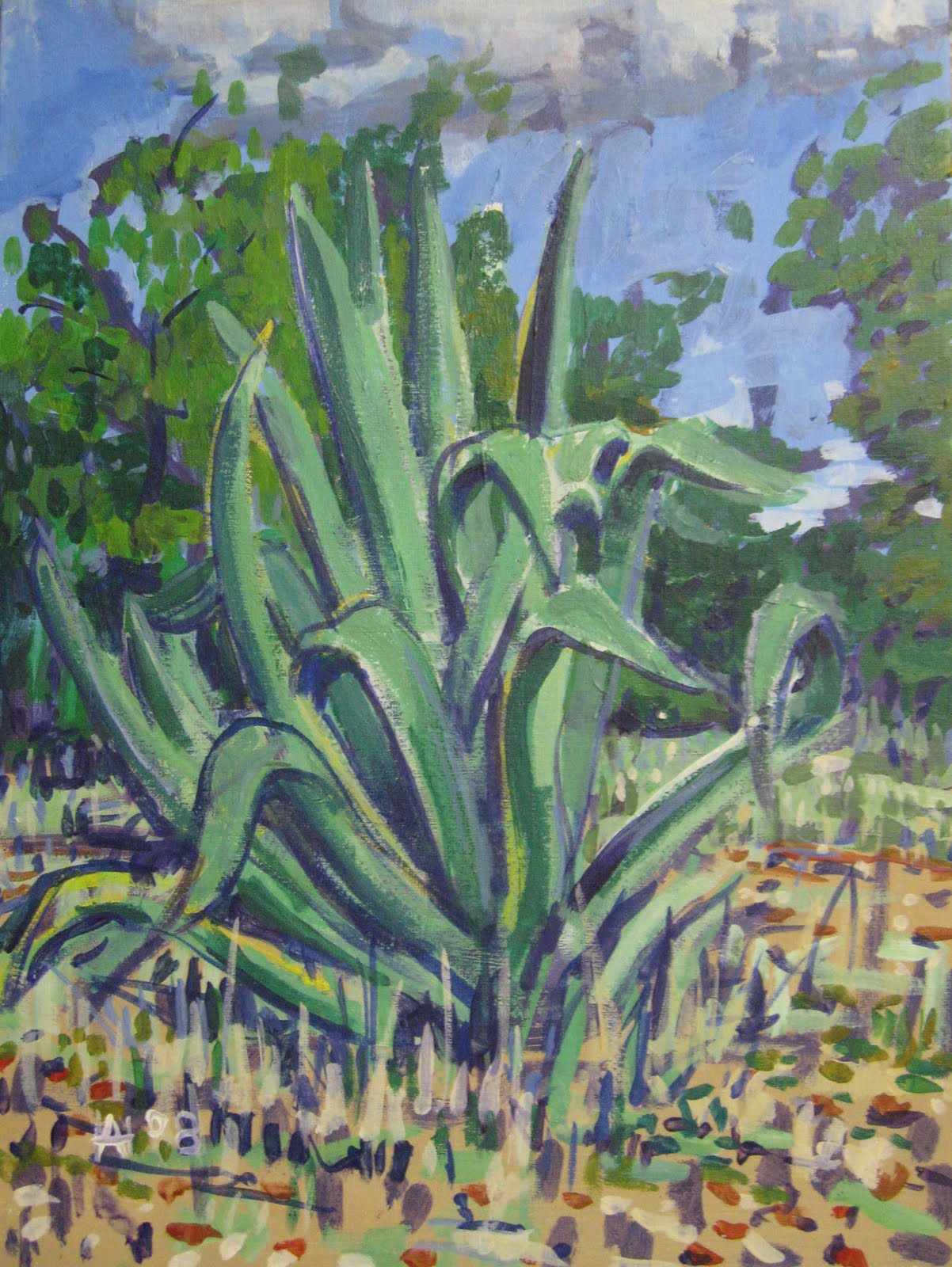
In 2008 I was lucky enough to be able to go on a trip to Lightning Ridge in the north west of  New South Wales. I produced sketches in acrylic paint on canvas board and took photographs. Some of these works are illustrated below with more finished works done in the studio.


A frequent sight in Lightning Ridge are the corrugated iron water tanks. Lightning Ridge is dry for much of the year and tanks are a necessity. They are usually the only thing left when a particular mining claim has been abandoned.
Lightning Ridge is famous as an opal mining town and evidence of mining is visible in most parts of the area. Below is a scene of an area that has been mined for opal. The white hillocks are the spoil from diggings  called "mullock heaps" locally.


Below is a more finished work in oil on canvas of one of the sketches in acrylic on canvas board above. With very clear skies, bright sunlight and with a predominance of whites from the claystone that underlies Lightning Ridge a reflected light is produced that affects the shadows making for some very intense blues even in the darker areas of the landscape. 


One of the well known landmarks in Lightning Ridge is a local church made of corrugated iron the building material of choice in times past. Painted in oils on canvas.


Two of the abandoned vechicles that are another feature of the Lightning Ridge landscape
One of the new concrete bridges on the road into Lightning Ridge. While "the Ridge" is very dry most of the year they sometimes experience severe floods that washed away the old wooden bridges isolating the town.


Oil Pastel Sketches of Houses By the River


I live very close to a park with a river running through it. As I am very often short of time in which to produce art works I decided to work in a way that took this into account. Painting in oils can be a fairly time consuming practice so I bought some cheap oil pastels and an A4 sketchpad and walked to the local park to spend a couple of hours sketching local scenery. (See an early post on this blog for details of techniques and materials). Illustrated above and below are some of the more recent works.


Thursday, July 14, 2011

Two Italian Postage Stamps issued during the Second World War

Below are two illustrations of Italian postage stamps that will be instanly recognised by most people. They show Hitler and Mussolini with the caption "Two Peoples One War" The first illustration is of a postage stamp issued during the Italian Occupation of Libya.


The Australian George the 6th 5 Pound Note

Below is an illustration of the George the 6th 5 Pound note issued between 1941 and 1948. Below are the specifications for the note.
 Obverse George VI & Coat of Arms
Reverse Commerce Scene
Signatories H. T. Armitage, Governor, Commonwealth Bank of Australia
S. G. McFarlane, Secretary to the Treasury
Size 180.34mm [width], 78.74mm [height]
Composition: Paper – 77 gsm
WatermarkCaptain Cook in centre oval
’FIVE’ behind each signature
Mintage 50,919,000
Serial Numbers Prefix letter R over numeral
R / 34 081001 to S / 84 1000000


The George the 6th Australian 10 shilling Note

Below is an illustration of the Australian George the 6th 10 Shilling note. This was the last series in the George the 6th 10 shillings and were only issued between 1952 and 1953. When Queen Elizabeth the Second came to the throne the design of the note was changed (see this blog) Below are the specifications for the note
 Obverse George VI
Reverse Manufactures
Signatories H. C. Coombs, Governor, Reserve Bank of Australia
Roland Wilson, Secretary to the Treasury
Size 137.16mm [width], 76.20mm [height]
Composition Paper – 77 gsm
Watermark Captain Cook in left oval
’HALF’ behind each signature
Mintage 74,648,000
Serial Numbers Prefix A or B over numeral A/75 000001 to B/49 64800


Wednesday, July 13, 2011

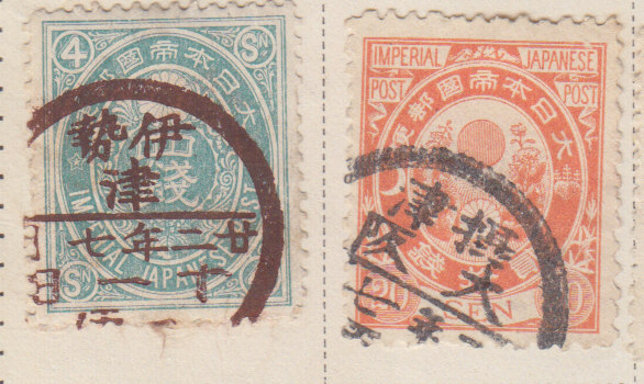
3 Pages of old Japanese Postage Stamps

I like Japanese postage stamps for their design and for the cancels they use on stamps. I think sometimes the stamps are more attractive with the cancels than mint. If they don't obscure too much of the stamp the cancels add another dimension by their calligraphy. Below are some illustrations of older Japanese postage stamps with some details of individual stamps


An Australian 1922 George 5th Penny

Below are the obverse (face) and reverse illustrations of a 1922 Australian penny. The condition is somewhat better than average, with no major marks, scratches or indentations. It does show handling wear and normally these pennies are graded by looking at the number of pearls and diamonds visible in the headband of the crown. 8 pearls and all diamonds clearly visible being an indication of fineness


Australian Silver Coins-Sixpences Minted in America

Below are two Australian sixpences minted in America during the Second World War. The reigning monarch was George the 6th. The sixpences were minted at the Denver mint (indicated by the small capital D below the Australian Coat of Arms)

Tuesday, July 12, 2011

The Australian 1966 Silver 50 Cent Piece

Below is an illustration of the 1966 50 cent piece. 80.0% Silver

The 1966 circular, .800 fine silver Australian 50 cent coin .
It was introduced on the 14th of February 1966.
The Royal Australian Mint in Canberra struck over 36 million 50 cent pieces however rising silver prices halted production. The Mint announced in late 1967 they were no longer releasing them into circulation. 
The silver 50 cent piece was replaced with a copper-nickel dodecagonal (12 sided) issue in 1969, no fifty cent coins having been minted for 1967 or 1968, although the 1966 dated 50c were still being made in 1967.There is very little difference (0.2 grams) in the amount of silver in the pre-1946 florins and the 1966 50c.


This example would be fairly close to uncirculated.

Two Pages from Old Stamp Albums With Persian/Iranian Postage Stamps

Illustrated below are two album pages of old postage stamps from Persia (now Iran). Below them are details showing close ups of some of the stamps


An Old Album Page of Postage Stamps from Lebanon

Illustrated below is a page from an old album of Lebanese postage stamps. With two details showing close ups.


Friday, July 8, 2011

Two Russian Czarist Stamps And With Soviet Overprints

Here are 4 illustrations of stamps used during Czarist times and their overprinted versions during the early Soviet takeover of government before Soviet stamps were issued.


Thursday, July 7, 2011

Some French Colonial Stamps

I think some of the most visually interesting stamps are those produced in Europe during the colonial period in the late 19th and early 20th century.Colours are generally minimal, but striking,often using the colour wheel putting yellows against purples, reds against greens and oranges against blues. The designs are also very interesting, using local scenes and people rendered in elegant line drawings underlying the bold areas of colour with only one colour and the white of the paper for shading. Stamp borders are often patterned adding another area of interest to the stamp. The enlargements below also reveal the range of marks used to create areas of lighter or darker shades using shorter and longer lines or dots widely or densely spaced. The two Madagascan stamps enlarged below illustrate the techniques used to perfection. Some of the smaller illustrations can be enlarged by clicking on them. (back page to return to the blog)       Below are some illustrations of some French colonial stamps from that period.

The two enlargments below are from the album page above


The enlargement below is from the album page above


Monday, July 4, 2011

Did I Buy an Original Gauguin at the Thrift Shop ?

As an habitual thrift shop customer I can never pass one without entering and having a look. The other day I went into a shop I frequent fairly regularly and it happened that a delivery of new/old things had just come in. I looked around and a painting caught my eye. At first I thought it was a print of a Gauguin but quickly realised it was an oil painting. As an admirer of Gauguin's work I have seen and studied more than a few both in original and in reproduction. This particular image I had never seen before and I thought perhaps a talented admirer of Gauguin had copied a detail from one of his works or had produced a more than fair semblance or pastiche based on their study of his work. I looked for a signature but couldn't find one.


The colour range seems to be fairly close to the colour range of Gauguin's painting and the brushwork too seems (with some reservations) close to the manner in which Gauguin applied paint. The psychological relationship of the figures is pure Gauguin with no connection to the viewer or each other.Each is wholly engrossed with their own occupation and the drawing is economical while perfectly descriptive in Gauguin's manner.


The aspects that bother me about it are the brushwork, some of the colour values and lack of finish. Some of the colour values are too weak or strong to give an overall unity. The darks of the background and palm shadows are too strong for the values of the foreground. Similarly the brushwork in some areas of the painting is confused and "muddy" or otherwise (as in the foreground) too broad. However all these points could be corrected with more work. There is an area in the foreground bushes that started light and was subsequently painted over in purple/grays. The dog appearing from the bushes in the foreground is also perhaps not realized with the kind of finish one would expect in a Gaugin but again more work would easily correct this.

A too oily application is also apparent with the oil running out of the paint and this has darkened with age giving an unaesthetic look to some of the surfaces.
Perhaps the strongest point mitigating against the painting being a genuine Gauguin is the support. This is a Grumbacher canvas board perhaps from the 1970's. However the grain of the canvas is quite coarse and this could be canvas or sacking (that Gauguin is known to have used) applied later to a canvas board.


Is  it Gauguin on a bad day ? Or an unfinished painting by Gauguin ? Or pastiche by a talented admirer ?