Below are some illustrations of old stamp albums. They show stamps of the now defunct Indian Princely States.
Sunday, June 19, 2011
Thursday, June 16, 2011
The Stamps of Indian Princely States-Hyderabad
Some of the earliest issues of the Indian State of Hyderabad from the turn of the 20 Century and earlier bear the legend Post Stamp and carry the seal of the Nizam of Hyderabad. A block of 6 half anna examples are shown below
These early stamps were issued in various denominations and 3 examples are illustrated. The half anna, 1 anna, and 2 annas.
Over the following decades the legend changed, first to Postage then Postage and Receipt and some were re-used with overprinted surcharges in black and red, then black and red concurrently with the seal of the Nizam as the central design.
In the 1930's other designs were issued. The stamps were larger than previously and issued in values of 4,6 and 8 pies. Other designs showed the High Court of Hyderabad, Char Minar and the Reservoir of Hyderabad. The Char Minar issue is shown here in some of the shades and surcharge overprints.
After the Second World War a Returning Soldier 1 anna stamp was issued. this was printed in a light and dark blue with three varieties. The light blue was unwatermarked and one variety of the dark blue was watermarked with the seal of the Nizam.
In 1947 a 1 anna view of Hyderabad Town Hall was issued. This was produced by the lithographic process, litho stamps are generally flatter and duller than off-set printed varieties. Still an attractively designed stamp
Between 1947 and 1949 another series was issued showing Hyderabad locales. The values were a 1 anna in green showing the Hyderabad Powerhouse, a 3 anna in blue/green showing Kaktyai Arch at Warangi Fort and a 6 anna in olive brown showing Golkunda Fort.
Wednesday, June 15, 2011
Stamps of the Princely States of India-Hyderabad
Osman Ali Khan, Asaf Jah VII, 10th Nizam of Hyderabad, GCSI, GBE, Royal Victorian Chain, MP (6 April 1886 - 24 January 1967). Granted the style of His Exalted Highness (1 January 1918), the title of Faithful Ally of the British Government (24 January 1918) and Nizam of Hyderabad and of Berar (13 November 1936). The last of the ruling Nizams; ruled absolutely from 31 August 1911 - 19 September 1948, when the state was formally annexed to the Union of India.
While many of the stamps of Hyderabad were variations on the seal of the Nizam in 1937 a small series was issued showing some of the government buildings of Hyderabad in honour of the last Nizam's silver jubilee. The values were 4 pies,8 pies, 1 anna and 4 annas. This small series of 4 stamps is reproduced below. (to enlarge please click on the illustrations then back page to return to the blog).
Wednesday, April 6, 2011
An Analysis of Monet's Paintings of Rouen Cathedral-Choosing The Motif
Why Choose the Cathedral and why concentrate on the Facade ?
Monet began the series in 1892 and finished his direct observations by 1893. Monet had rented temporary spaces opposite the cathedral for the purpose and made 30 paintings directly from the motif. These were then re-worked in his own studio during 1894. Of the 30 paintings 20 were chosen as the best of the series and exhibited in Paris by his dealer.
The series was an attempt to paint the same object in different light conditions and at different times of day something that had begun to appear in Monet's work perhaps most famously in his series of "Haystacks".
However where the haystacks are situated in a landscape, in the cathedral series Monet concentrates almost solely on the cathedral's facade. Why did Monet choose the cathedral and concentrate exclusively on the facade ?
Monet's interest lay in the natural light on an object rather than the object itself and he had developed the technique of small brushstokes in minor variations of colour to register the minor variations that are the result of light striking a form. In other words, a flat surface offers very few opportunities to modify colour. Those parts of the cathedral (sides,walls,roof) that tend to be flat are of no real interest to him. The facade (and perhaps only the facade) presents the kind of surface that lends itself perfectly to the technique Monet had already developed. Further the Gothic facade with its sculptures and carvings gives Monet an opportunity for his particular technique perhaps unparalled in any other building he could have chosen.
Monet began the series in 1892 and finished his direct observations by 1893. Monet had rented temporary spaces opposite the cathedral for the purpose and made 30 paintings directly from the motif. These were then re-worked in his own studio during 1894. Of the 30 paintings 20 were chosen as the best of the series and exhibited in Paris by his dealer.
The series was an attempt to paint the same object in different light conditions and at different times of day something that had begun to appear in Monet's work perhaps most famously in his series of "Haystacks".
However where the haystacks are situated in a landscape, in the cathedral series Monet concentrates almost solely on the cathedral's facade. Why did Monet choose the cathedral and concentrate exclusively on the facade ?
Monet's interest lay in the natural light on an object rather than the object itself and he had developed the technique of small brushstokes in minor variations of colour to register the minor variations that are the result of light striking a form. In other words, a flat surface offers very few opportunities to modify colour. Those parts of the cathedral (sides,walls,roof) that tend to be flat are of no real interest to him. The facade (and perhaps only the facade) presents the kind of surface that lends itself perfectly to the technique Monet had already developed. Further the Gothic facade with its sculptures and carvings gives Monet an opportunity for his particular technique perhaps unparalled in any other building he could have chosen.
Monday, March 28, 2011
Paintings of the Nude in the Garden
Some small oil paintings I have been working on with the subject of the nude in the garden. Sometimes with the addition of fragments from the oil pastel sketches I have been doing.
Thursday, March 10, 2011
More sketches in oil pastel
These are more sketches in oil pastel I have been doing over the past weeks. Anyone wishing to see the technique and materials I am using can consult an earlier post "Sketching in Oil Pastels" by going back through the blog until they reach the post.
Wednesday, March 9, 2011
The Venus of Willendorf-An Analysis
Believed to have been carved by an early European hunter-gatherer and standing only 11 cms high the Venus of Willendorf is perhaps one of the most compelling sculptures ever made.
Its aesthetic appeal for us perhaps resides in the fine feeling of balance and "rightness" in the handling of the volumes of the head ,torso and lower limbs and fine carving of hair and anatomical detail. Add the mystery of its motives and we have an object that both pleases and perplexes us.
It is thought the figure is a representation of female fertility. Those areas associated with fertility,breasts,buttocks.stomach and labia (suggesting pregnancy) are treated almost to the exclusion of everything else. The figure has no face (it is not a portrayal of an individual) and no feet. The arms are rendered as mere sticks.
Significantly, perhaps, what appears to be braided hair is included. Why leave hair in? Once we reach maturity (that is, our fertile period) the only parts of our bodies that continue to grow are our hair and fingernails. (Hair and fingernail clippings have a long history in sympathetic magic as needing extreme care in handling. Often being destroyed to prevent their use in sorcery). The mystery of hair growth in a pre-scientific age can perhaps easily be seen as an aspect of fertility. (as its loss is a part of loss of fertility). It has also been speculated that the small "pecked out" area (seen best in a back view) is a representation of a braided hair belt circling the stomach area perhaps allying this mysterious power of growth with the significant area of female fertility.
These speculations are perhaps confirmed by another of the venus figurines. Carved into a small piece of limestone and showing a similar treatment of the female figure (but without the aesthetic appeal of the Venus of Willendorf). This figure holds an animal horn that would also exhibit this same mysterious power of growth after maturity
Its aesthetic appeal for us perhaps resides in the fine feeling of balance and "rightness" in the handling of the volumes of the head ,torso and lower limbs and fine carving of hair and anatomical detail. Add the mystery of its motives and we have an object that both pleases and perplexes us.
It is thought the figure is a representation of female fertility. Those areas associated with fertility,breasts,buttocks.stomach and labia (suggesting pregnancy) are treated almost to the exclusion of everything else. The figure has no face (it is not a portrayal of an individual) and no feet. The arms are rendered as mere sticks.
Significantly, perhaps, what appears to be braided hair is included. Why leave hair in? Once we reach maturity (that is, our fertile period) the only parts of our bodies that continue to grow are our hair and fingernails. (Hair and fingernail clippings have a long history in sympathetic magic as needing extreme care in handling. Often being destroyed to prevent their use in sorcery). The mystery of hair growth in a pre-scientific age can perhaps easily be seen as an aspect of fertility. (as its loss is a part of loss of fertility). It has also been speculated that the small "pecked out" area (seen best in a back view) is a representation of a braided hair belt circling the stomach area perhaps allying this mysterious power of growth with the significant area of female fertility.
These speculations are perhaps confirmed by another of the venus figurines. Carved into a small piece of limestone and showing a similar treatment of the female figure (but without the aesthetic appeal of the Venus of Willendorf). This figure holds an animal horn that would also exhibit this same mysterious power of growth after maturity
Sunday, March 6, 2011
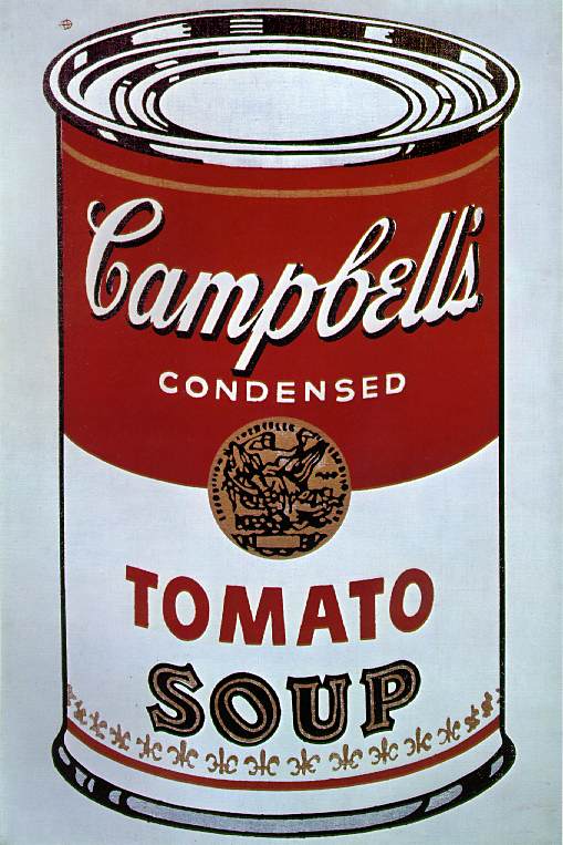
The Lascaux Caves,Chardin and Campbell's Soup
The Caves of Lascaux in France have prompted many pages of speculation on their meaning or significance. One of the most popular is their supposed significance in ritual or sympathetic magic. A kind of sacred site for the hunter-gatherers of pre-historic Europe. The speculations may well be right. As interesting as these speculations are if we start with one thing we can be sure of about these depictions and compare them with other art-works perhaps we can also make some interesting points.
The one thing we know about the animals depicted in the caves is that they were eaten as food by the artists who painted them.
If we compare the paintings of the cave to "The White Tablecloth" by Chardin we can see that the food depicted here has undergone a process. Where the food of the Lascaux caves is still "on the hoof" so to speak, the food of Chardin's painting has been processed from it's raw form of meat, grain and fruit into sausage, baked bread and fermented wine. (How differently we may "read" Chardin's painting had only bread and wine been depicted).
Again when we look at Andy Warhol's "Campbell's Soup Can" we only know this is food by reading the label on the can. In fact if the label read something like "Monkey Embryos" we perhaps wouldn't see food at all whether the can contained tomato soup or not.
The one thing we know about the animals depicted in the caves is that they were eaten as food by the artists who painted them.
If we compare the paintings of the cave to "The White Tablecloth" by Chardin we can see that the food depicted here has undergone a process. Where the food of the Lascaux caves is still "on the hoof" so to speak, the food of Chardin's painting has been processed from it's raw form of meat, grain and fruit into sausage, baked bread and fermented wine. (How differently we may "read" Chardin's painting had only bread and wine been depicted).
Again when we look at Andy Warhol's "Campbell's Soup Can" we only know this is food by reading the label on the can. In fact if the label read something like "Monkey Embryos" we perhaps wouldn't see food at all whether the can contained tomato soup or not.
Sunday, February 13, 2011
On "Modernist Painting"
One of the "discoveries" of "modernism"and perhaps fundamental to its practice is an understanding of how the human brain recognizes objects or "things" in a painting. Before modernism if painters wished to exploit/explore bold colour combinations they had to pick their subject. For example Turner's use of sunrise/sunsets or Delacroix's trip to North Africa where the intense light produced more intense colour.
This "discovery" allowed painters to use the inherent colour of oil paint without the constraints imposed by the subject as exemplified by painters like Derain, and others in what was called the Fauvist Movement.This understanding that shape could be rendered very simply without loss of recognition also allowed simple distortion to be used expressively as the German Expressionists began to do.
As paintings became flatter and shapes simpler borrowing from Eastern and African art intensified.The simplified planes of African masks or the use of pattern to differentiate between one flat surface and another as Asian painters did began to appear.
Another result was European "primitive" painters began to be appreciated. "Primitive" work perhaps proceeds from the technical (and perhaps emotional/intellectual) limitations of its' producers but this was no longer felt to be a barrier to the production of art.
Finally it is perhaps due to early modernist ideas that our world is now filled with signs that use a flattened and simplified image to communicate messages to the public
It was only when colour began to be intensified as a device to heighten the expressive impact of painting, as in the works of painters like Van gogh and Gauguin that some of the principles underlying "modernist" painting began to be thought out and explored.
Two of the implications of intensifying colour were that paintings tended to become flatter and shapes simpler. Fewer tonal variations produced flattened surfaces and simplified shapes.( This flatness and simplification finally became a fetish)
It was soon realized that while shapes became simpler and flatter there was no real loss of recognition of what was being represented.The most important aspect of anything to our recognition (re-cognition) of it is its shape.This literally overpowers any other consideration in our recognition of any given thing we are looking at.
This is quite easily demonstrated by some simple drawings of silhouettes
Whoever can draw a simple silhouette can communicate through line to another what they wish their viewer to "see". Consider how much is left out of the drawing colour,texture any sense of roundness but still we recognize an apple ,a pear, a lemon. Even a "fish" can be rendered and recognized as a very simple shape.
A simple "still life" of two pears and two apples scribbled in with a more or less accepted local colour of green apples and olive green pears and brown table-top and we have a "scene" we can accept quite readily.
Similarly an unexpected local colour doesn't overpower our recognition of apples and pears but does set up a tension between the shape we recognize and the colour we don't![]()
;As paintings became flatter and shapes simpler borrowing from Eastern and African art intensified.The simplified planes of African masks or the use of pattern to differentiate between one flat surface and another as Asian painters did began to appear.
Another result was European "primitive" painters began to be appreciated. "Primitive" work perhaps proceeds from the technical (and perhaps emotional/intellectual) limitations of its' producers but this was no longer felt to be a barrier to the production of art.
Finally it is perhaps due to early modernist ideas that our world is now filled with signs that use a flattened and simplified image to communicate messages to the public
Thursday, February 10, 2011
An Analysis of Degas influence on Gauguin
Gauguin was an admirer of Degas work and borrowed some of his stylistic devices in a modified form to suit his own expressive needs. Degas as a practitioner of the "modernist" currents of his own day, in opposition to the literary conceptions from Greek mythology of the Salon, wished to present the life of his own times and in a way that expressed their immediacy. Typical of this approach " A Ballet Scene from an Opera Box ". 
In this series Degas also adds the device of excluding the viewer. They turn their back or bend over wholly concerned with the acts they are performing. In fact Degas is quoted as saying to the writer George Moore "Until now the nude has always been represented in poses that presuppose an audience but these women of mine are honest, simple folk, involved solely and entirely in what they are doing."
Degas presents the scene as a "snapshot" of a moment. In the foreground is a woman with a fan, behind her the prima ballerina, behind her the other dancers. Executed in pastel (a medium that reinforces the sense of immediacy) and not a large work at 62 mm x 50 mm. Given that we are meant to view this as a performance happening now ( in reality a moment of seconds) we can be sure that unless Degas worked from a photograph (just possible) the scene would be the result of sketches drawn on the spot over some time (perhaps with models in the studio as further reference) then worked up in the studio. That is, it is a carefully composed work to express a moment in time. This sense of "snapshot" is achieved by Degas method of overlapping and cropping. The woman viewer is overlapped and cropped by the edge of the work, similarly she overlaps and crops the prima ballerina, who in turn overlaps and crops two of the dancers behind her. The two other dancers are overlapped and cropped by the top edge of the work. Not one figure is seen in their entirety a device used again and again by Degas in many of his ballet works, his paintings of jockeys and horses and women bathing, combing their hair.
When Degas began his series of individual women at their toilet this cropping device was used consistently.The women bend over or step into the bath or use a towel that partially covers their body.
Gauguin had a different idea to express, that of the enigma of Hawaiian islanders, their "otherness" in relation to "civilized" society but in many of his works the devices used by Degas are presented in a modified form. Gauguin's figures are often overlapped and cropped by each other and and even when facing outward make no psychological contact with the viewer or with each other.When Degas' figures are in groups they are psychologically bound together by common purpose. In Gauguin's paintings, groups, while overlapped and cropped in a similar manner to Degas are self contained individuals. Where Degas figures are active, dancing, washing.combing hair, Gauguin's figures do nothing.
Wednesday, February 2, 2011
An Analysis of Chardin's "The White Tablecloth"
Unpretentious in size (96.8 cm x 123.5 cm) and simple in presentation but rich in thinking about visuality. Colour is here reduced to variations of brown and grey to emphasize shape and texture. The core of this work is in Chardin's understanding of composing very simple objects in deeply considered ways. It has been said (ad nauseum) that "less is more" and here perhaps that really is true.
With three larger objects, the tablecloth,table and drink cooler Chardin sets up the major shapes within the painting. His viewpoint renders what are circles into ovals. The dominant shape in the composition is an oval and Chardin manipulates the smaller objects to produce as many ovals as possible. The cut bread, one wine upright the other glass on its side, the sausage cut and placed in three ways, the lifted lid on the ceramic jug, the plate (here metal not ceramic to give variations of grey).
The smaller objects also "echo" the relationships throughout the composition. For example the ceramic jug in the drink cooler echos the relationship of tablecloth to the table. Similarly the cut bread exposing the white under the brown crust.
The placement and arrangement of objects coupled with the direction of light (as if through an open door) produces an ascending and descending rhythm within the composition. The smaller drink cooler against the larger table. The bottom edge of the tablecloth runs upward, the bread placed over the edge of the plate and also slightly higher than the far edge of the table. Against these ascending/descending rhythms Chardin places the knife and bottom of the wine glass on its side pushing into the space for balance. These minor variations also occur in objects placed in the drink cooler with the neck of the far bottle appearing over the rim of the cooler with the open lid of the ceramic jug as a kind stop that echos the the knife and wine glass.
The overall effect is as if two people had just left the room after a basic meal of bread,wine and sausage but through his understanding of painting Chardin invests the scene with intelligence and feeling far beyond its apparent simplicity.
With three larger objects, the tablecloth,table and drink cooler Chardin sets up the major shapes within the painting. His viewpoint renders what are circles into ovals. The dominant shape in the composition is an oval and Chardin manipulates the smaller objects to produce as many ovals as possible. The cut bread, one wine upright the other glass on its side, the sausage cut and placed in three ways, the lifted lid on the ceramic jug, the plate (here metal not ceramic to give variations of grey).
The smaller objects also "echo" the relationships throughout the composition. For example the ceramic jug in the drink cooler echos the relationship of tablecloth to the table. Similarly the cut bread exposing the white under the brown crust.
The placement and arrangement of objects coupled with the direction of light (as if through an open door) produces an ascending and descending rhythm within the composition. The smaller drink cooler against the larger table. The bottom edge of the tablecloth runs upward, the bread placed over the edge of the plate and also slightly higher than the far edge of the table. Against these ascending/descending rhythms Chardin places the knife and bottom of the wine glass on its side pushing into the space for balance. These minor variations also occur in objects placed in the drink cooler with the neck of the far bottle appearing over the rim of the cooler with the open lid of the ceramic jug as a kind stop that echos the the knife and wine glass.
The overall effect is as if two people had just left the room after a basic meal of bread,wine and sausage but through his understanding of painting Chardin invests the scene with intelligence and feeling far beyond its apparent simplicity.
Tuesday, February 1, 2011
GAUGUIN-An Analysis-Gauguins Tahitian Figures-the Stylistic Devices
Many of the human figures in the works Gauguin produced in Tahiti have a similar distant "unconcerned" air about them. Gauguin achieves this by using and re-using certain stylistic devices. Psychologically the figures never engage the viewer with eye contact. This is evident in in works such as "Two Tahitian Women on the Beach" or "The Siesta" or the very famous "Two Tahitian Women" who all appear to be psychologically engaged with their individual concerns or something out of the picture frame.
To take as our first example "The Siesta", the women appear not only unconcerned with the viewer but also with each other. Although they constitute a group each seems to be occupied with their separate thoughts Three of the women have their back to the viewer the other lying parallel to the picture frame seems to have her attention focused on something outside the picture frame. The fifth woman focuses on her task of ironing clothes.
A similar device is used in "Two Tahitian Women on the Beach". One woman turned away from the viewer the other apparently engaged by something outside the picture frame. Between them there is also no psychological connection.
This same device is apparent in "Two Tahitian Women" although they both face the viewer neither is engaged with the viewer and both appear to be psychologically engaged with different things outside the picture frame.
Gauguin also uses other devices to emphasise the the sense of self containment we feel the figures possess. Often they are tightly "overlapped" or quite intimately close but rarely communicate with each other. Their bodies are often without "spaces" within them. Arms and legs are pulled in close to the body, or they are drawn from an angle that reduces the spaces the viewer can see.For example the women on the beach; one sits cross-legged with a dress obscuring her legs and draws her arms close to her body, the other is half turned in a way that hides the space between the arm that she leans on and her body. Neither do we often see a "whole" body. In "The Siesta" for example bodies are turned or overlapped in such a way that we see only one hand or foot or only a torso and this creates for us a sense of their intimacy as a group while contrasting their self containment as individuals. This may be a device Gauguin borrowed from Degas (who he admired). In many of Degas "ballerina" works he used the same device but rather to give a sense of immediacy to the scene.
Subscribe to:
Posts (Atom)